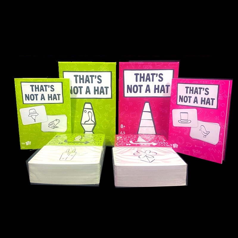
"THAT'S NOT A HAT" is a quirky board game designed for players aged 8 and up that challenges traditional expectations—inviting you to look at the familiar in a completely new way. The packaging itself is a playful blend of bright pink complemented by white and blue text and detailed illustrations. Dominating the design is a large, eye-catching image of a traffic cone, an unexpected symbol that hints at the game’s fun twist on everyday objects.
Complementing this standout graphic are smaller visuals, including a spoon, a top hat paired with a bird, and other intriguing iconographies that play with the idea of misdirection. The title suggests a delightful inversion of what you might assume at first glance: not everything labeled like a hat is, in fact, a hat. This design approach sets the stage for a game rich in humor, visual puns, and imaginative challenges.
The overall aesthetic is both vibrant and whimsical, making it a perfect choice for casual gatherings, family game nights, or any situation where creative thinking and lots of laughter are welcome. With its bold graphics and colorful design, "THAT'S NOT A HAT" promises players a game experience that’s as engaging visually as it is in its play mechanics.
Does the playful subversion of expectations in this game spark your curiosity? We can explore further how such design choices not only enhance the gameplay experience but also invite creative conversations about the objects we take for granted!